The biggest mistakes I've made with Lunch Money (so far)
Quick introduction: 👋 Hi, I’m Jen! I’m the founder, chief budgeter, engineer & designer behind Lunch Money, a personal finance and budgeting web app.
It’s been 6 months since the official launch of Lunch Money and I’ve been sharing milestones, both big and small. But that’s hardly the full picture. While I like the idea of sharing highlights regularly to keep morale up, I thought it would be a good time to reflect and start a periodic series on the biggest mistakes I’ve made (so far).
Mistake: Having an ill-prepared launch
We launched via Show HN on Hacker News in late August 2019. Readers upheld Lunch Money’s standing on the front page for nearly 24 hours!
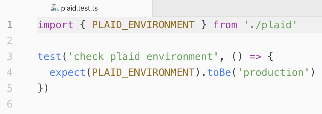
About an hour into the launch, I started to get notifications and emails that users couldn’t connect their accounts via Plaid, our third-party banking importer. In a state of panic, I spammed their support channel and the two friends I know who worked there, crying for help. That is until I realized that it was my own dumb fault because I accidentally left my Plaid environment set to development which only supported 100 connected accounts. My free test accounts which I had been diligently rationing up until this point had been depleted and Plaid was rightfully denying any new connections.
Lesson learned: Have tests in place to check critical environment variables are properly set before deploying to production
A simple test could have saved me a ton of headache
Next, I ran into issues with a third-party email service provider, Sendgrid. I was using Sendgrid to send confirmation emails to new users as they signed up for Lunch Money. The issue was twofold which I discovered while prematurely celebrating the first fix. I had hit my 100 emails per day limit due to being on the free plan, so I quickly upgraded to a paid plan only to find out that Sendgrid was also rate-limiting me! Thankfully, this was quickly resolved through their responsive support chat.
Lessons learned: Ensure your current plans with third-party services you depend on are sufficient, and monitor usage on launch day to catch issues before they arise
Side note: Lunch Money’s launch was by-and-large unplanned and accidental. If you want to read the “full story” of the launch, check out the Indie Hackers post I had written at the end of the day.
Mistake: Assuming user sentiment
I started Lunch Money as a web app since that is the platform I’m most comfortable with and can iterate quickest on. I like the idea of having more screen real estate for a proper user interface and I also have a lot more experience (and fun!) designing and coding for web apps over mobile apps.
However, at the back of my mind I always felt that I would need to have a mobile app. Who would use a new budgeting app if it was not mobile-first? Who even owns a laptop or desktop computer anymore?
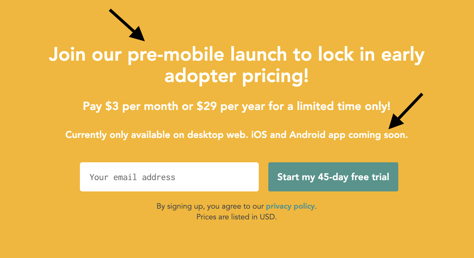
I had a fully-functioning web app that was mobile responsive, but I had also fully convinced myself that no one would take my app seriously because it wasn’t available natively on iOS or Android. Though I wasn’t going to let this be a barrier to launching, I ended up pricing my product low enough as compensation for the fact. I was also a bit overzealous in my copy. I had a line that promised a mobile app was coming soon and I even called it the “pre-mobile launch”.
Way too much attention on the lack of a mobile app 🤦♀️
After launching, I realized through user feedback that a mobile app was not the dealbreaker I hyped it up to be. Of course, there were a few users who made it clear they would only subscribe once a mobile version was available, but there were way more people who were just excited about the potential of Lunch Money itself. It became obvious that I should focus on continuing to develop the core product rather than halting progress in favour of spawning a half-baked version on a new platform.
Lesson learned: Don't assume what is and isn't important to your users. Focus on an MVP and wait for feedback.
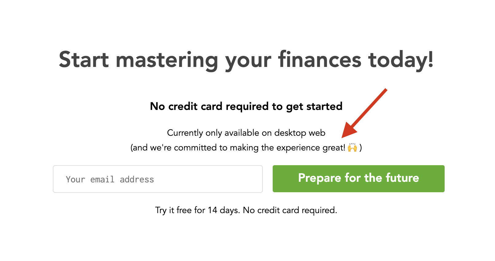
Looking back now, it was the right decision to hold off on a mobile app. Keeping parity with both web and mobile while iterating regularly on the product would have been nearly impossible. The web version changed so quickly with many features having been completely re-written in the last 6 months. That would have taken more than twice the time if I also had to consider the mobile app whose update cycles are at the mercy of Apple and Google.
Embracing the fact that we’re a web app!
This is not to say that Lunch Money will never have a mobile app. I’m still working on rounding out core features and as the product approaches stability, I’ll spend time thinking seriously about a mobile app. Whether that involves hiring a contractor, outsourcing the development or encouraging users to build their own via our developer API is still up in the air!
Mistake: Charging too low…
As mentioned earlier, I priced Lunch Money initially to overcompensate for the lack of a mobile app. At launch, the product was offered at $3/month or $29/year.
I was getting feedback over the next few weeks that my pricing was too low! If your users are telling you your price is too low, it’s even lower than you think.
Mistake: … and charging too high
Over the course of 4 weeks, I experimented with pricing. I raised my price every time I came out with a new major feature, which, at that time, was happening on a weekly basis. These are core features to the product today, such as CSV import (+$2/month) and the Query Tool (+$1/month). My pricing basically went from $3/month to $5/month to $6/month and finally $8/month.
At $8/month, there was a noticeable drop in signups. But that by itself was not the issue as it was compounded by my next mistake..
Mistake: Offering too long of a free trial
At launch time, we were offering a 45-day free trial. The idea was to allow users the experience of a whole monthly budgeting cycle to assess Lunch Money. Also, YNAB, who I perceived to be my biggest competitor, was offering a 38-day free trial so I thought that with a longer trial and lower price, Lunch Money would be more appealing.
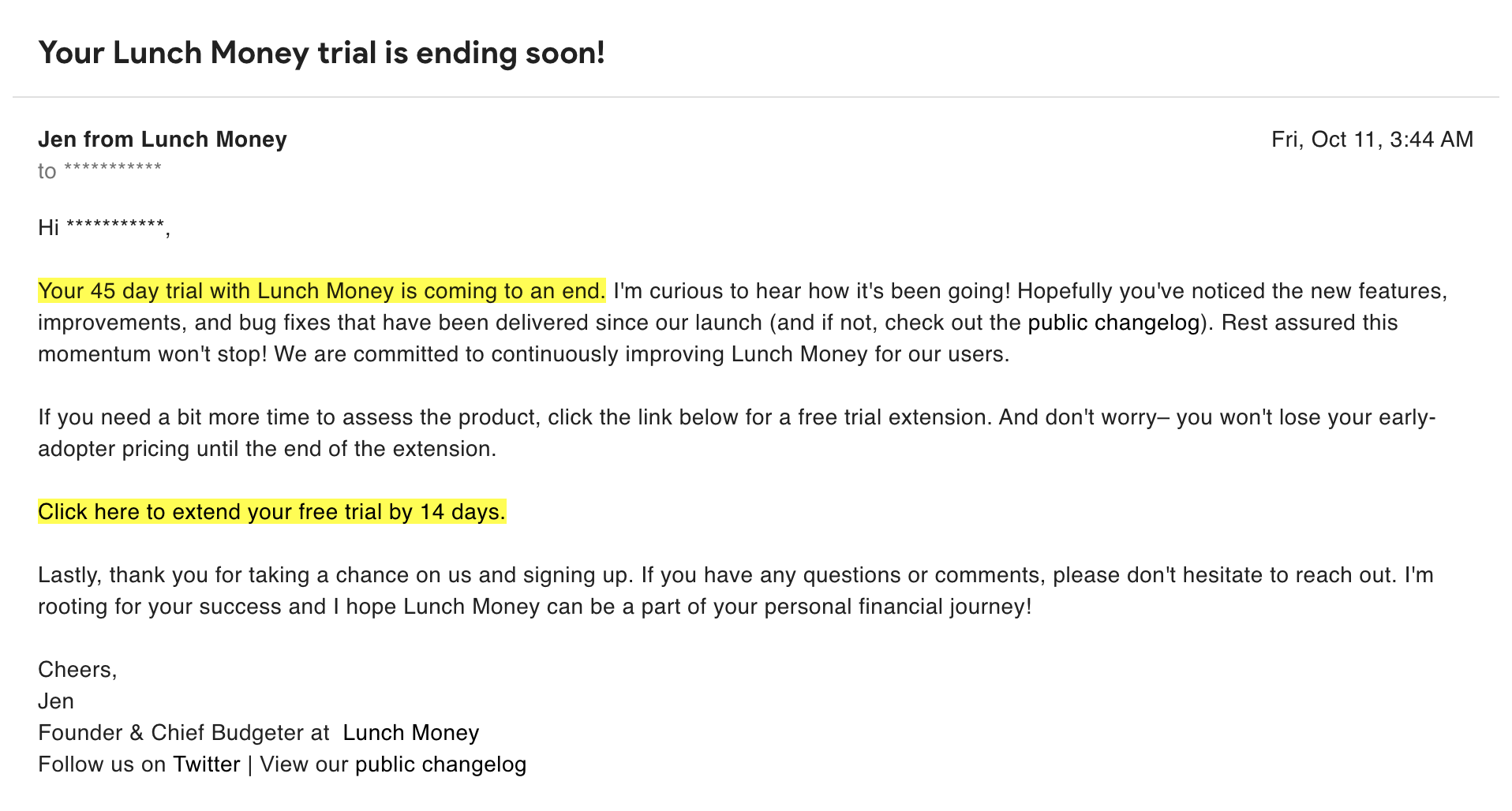
While I could have been right about that, it wasn’t worth the painfully long sales cycle that came with offering a 45-day free trial PLUS the option for a whopping two week trial extension. Major facepalm. At the longest, users were not going to convert until 2 months after initially signing up. This made assessing product-market fit an unnecessarily long process. Also, very few users opted to extend the trial after 45 days which was unsurprising– if a user is still on the fence at day 45, they probably won’t be subscribing.
Fully prepared to give away a 2 week trial extension on top of a 45 day free trial… 🤦♀️
Eventually, at the advice of a friend much smarter than me, I decided to shorten the free trial length to 14 days. Even though I now ran the risk of users not having enough time to assess the product, I felt the shorter trial might instill some urgency in users, and I was still offering the option for a 1 week trial extension.
Lesson learned: Be aware of the difficulties in offering too long of a free trial
It’s worth mentioning now that this realization and the realization that I was charging too little happened in parallel so I actually ended up increasing the pricing to $8/month AND decreasing the free trial length to 14 days on the same day. Yes, I changed two very important variables at the same time. My sign ups dropped drastically and I had no way of knowing if it was because I was charging too high or my trial length was too short.
 My two inner selves when I realized what I’d done
Lesson learned: If you are testing major changes, do not change two variables at the same time. (Duh!)
The recovery: I ended up sticking with the shorter trial length and offering a discount off the $8/month pricing which was determined to be too high. I’d like to eventually get Lunch Money to a point where it is worth $8/month and until then, I’m offering lifetime percentage discounts. I started off with a 30% discount for Cyber Week which had great reception. Afterwards, I lowered the discount to 20% off which amounts to $6.40/month. Based on the rate of new signups and a user feedback survey I sent out a few weeks ago, I’m confident the current trial length and monthly price are both reasonable for the time being.
Mistake: Being too afraid to share my story
For a month and a half, we didn’t have an About page. I wasn’t sure how Lunch Money would be perceived if people found out there was a singular engineer behind a personal finance app. I wrote an article on my personal blog that would link Lunch Money to me, but it would only be discoverable by those eager enough to read the origin story.
After some initial feedback, I decided to implement an About page and start sending a welcome email to new users introducing myself as the one-woman team behind the product.
Let's not be strangers anymore 👋 We finally have an About page! https://t.co/koZiMSAM3o
— Lunch Money (@LunchbagLabs) October 5, 2019
I now regularly get emails back from users letting me know that they find my story inspiring, or that they love the fact that an indie developer is behind the product! 🥰
My mind is kind of blown that @lunchbag made Lunch Money on her own _and_ she's the support staff.
— Eric Windmill (@ericwindmill) February 10, 2020
The unbelievable thing is that Lunch Money is truly better than Mint and YNAB. I've never been able to keep using budgeting software because they're so bad. Not anymore!
Lesson learned: People care about the narrative behind your product, so don't be afraid to tell your story!
Also, I sent out a user survey recently and 20% of responses cited me as an indie developer as a reason why they love Lunch Money. All of this was incredibly heartwarming and I learned to embrace my story more.
So much ❤️ from our users!
Closing Thoughts
I’m happy to report that despite all these bumps in the road (and many more that didn’t make the cut for this post!), Lunch Money is still alive.
Of course, I never thought that any one of these mistakes would be the downfall of Lunch Money but I’m sure in the moment, each one felt like the dumbest thing I could have possibly done.
 My overdramatic self reacting to my mistakes as they happen
This whole journey is a learning process and I’m grateful to be able to share mine transparently. It’s important to not only celebrate the highs and stay humble, but also face the lows and forgive yourself.
I’m sure there are many more mistakes to be made on the horizon and I look forward to writing and laughing about them in another 6 months!
